A boutique coffee roaster invested in quality over quantity.
Whiplash Coffee
The Strategy
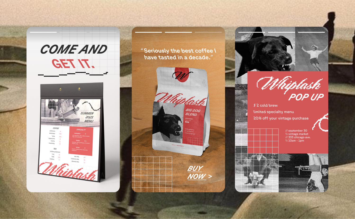
Wake up, chug some coffee, do cool sh*t. Whiplash is a no-frills coffee roaster inspired by the raw, untethered energy of 1980’s skate culture. They’re focused on crafting simple, yet extraordinary coffee guaranteed to jolt you awake and make the most of your day.


The Logo
We wanted the brand to inspire energy and movement in a digital world, so we transformed a classic script into something more modern with liquified pixels for the logo. For headlines, we experimented with the literal concept of whiplash by alternating between retalic and italic typefaces.

The Colors

Whiplash keeps their coffee classic and simple, so we went with a straightforward color scheme of asphalt black, cloudy grey, and a jolt of electric red.
